
Year:
2021
Team:
Product lead, PO, 5 Devs, 1 Product Designer
My Role:
Product Designer 👋🏼
What does it mean to give users control?
First a little context...
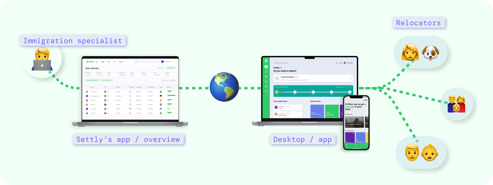
Settly is a platform to connect people from all over the world and help them with their relocation process.
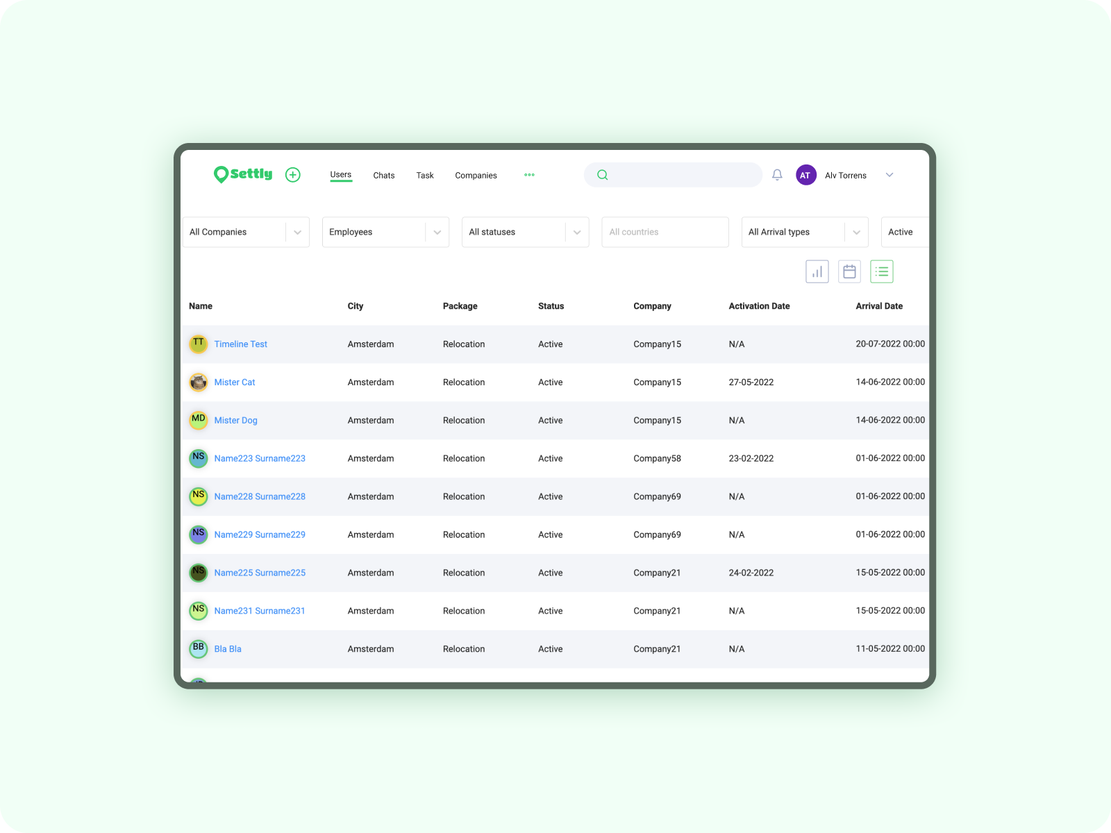
On Settly we connect relocators with immigration specialists through an app and a back office system, each immigration specialist supports several relocators on their journey. And here's where an overview is a crucial part of the system.
The overview allows the immigration specialist to keep track of all their cases, and to see the critical information, dates, and action items.
In a nutshell is a table /filters design case, but stick with me I promise it will be fun ✨.
The problem
As part of assessing the platform's most used features, I was conducting research* with the PM of the team, and during that assessment, we found out that the user "overview" feature was not one of the best evaluated by the team.
Business-wise, it was impacting the effectiveness of the operations team and the capacity of the immigration specialist to deal better with a high volume of relocators. Time per user was increasing because they could not fulfill tasks within the system and they were using a lot of manual copy-pasting between tools to fulfill those tasks.
* The research consisted on a survey listing the "core features" of our back end system and we were meassuring, perceived effort to use, frequency of use and perceived added value, this survey was distributed across the whole operations team.
To learn the why’s? I did a round of interviews, making sure to include all the roles that used the overview. (The immigration specialist is one role, but we also have leaders and managers who also need information on this screen to report or perform their work more efficiently)
Some of the questions I wanted to answer were:
- What's the purpose of the usage of the screen, and what expectations do they have? (Why is not being well evaluated)
- Understand how easy or hard is it to access the information needed for your role.
- How much time does it take? In the case of the Immigration, specialist what’s the average time invested per relocator?
- What’s the most accessed information? What’s the most valuable one?
- When extracting info from the platform, for reporting, client meetings, and sharing with other hosts, what’s the expected way of doing it?
Some insights and pain points revealed during the session were:
- Every different role using the app has a different approach to the usage of the screen
- The time varied depending on the volume of relocators, but we could establish an average.
- The overall screen is restrictive (It was limiting the way users can work on it, resulting in the use of other extra tools and extra manual work)
- Items are hard to find due to their similarity (text-heavy with the same hierarchy)
- Too much cognitive load
- Load issues
- Extracting information (Some times the team would need to take time out of the devs to export or find specific information)
So, giving control to the users
With the insights and problems in mind, is already. time to design (that's why you are reading this right?)
And in this case "giving control to users" was the idea resonating with me, but what does it mean to give control, and why?
Well in this case, one of the things that define my approach to the design was understanding that every type of user of this screen was in need of different features, to accomplish different goals, Ex. Managers wanted to report, but the host wanted to manage users, and account leads wanted to see overall progress.
So the system should be flexible enough to adapt to every type of user and every type of usage, but at the same time, it should not be complex to avoid the cognitive load, and the "hard to find" feeling.
So at this point, I based my design on the hypothesis:
"If we give control of the overview to the users, they will be able to organize their work in the way that best suits their necessities"
After some design iterations, hours of refinements, and more than 50 cups of coffee, I arrived at a Design version that I felt comfortable to test.
Testing and launching
Ah, the thrill of crafting an internal tool for our team! 🚀
We were all in agreement: once we set sail with our creation, we'd keep a watchful eye on its journey, ready to pivot and adapt as needed.
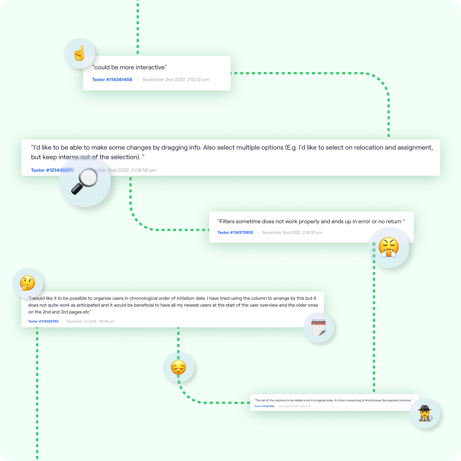
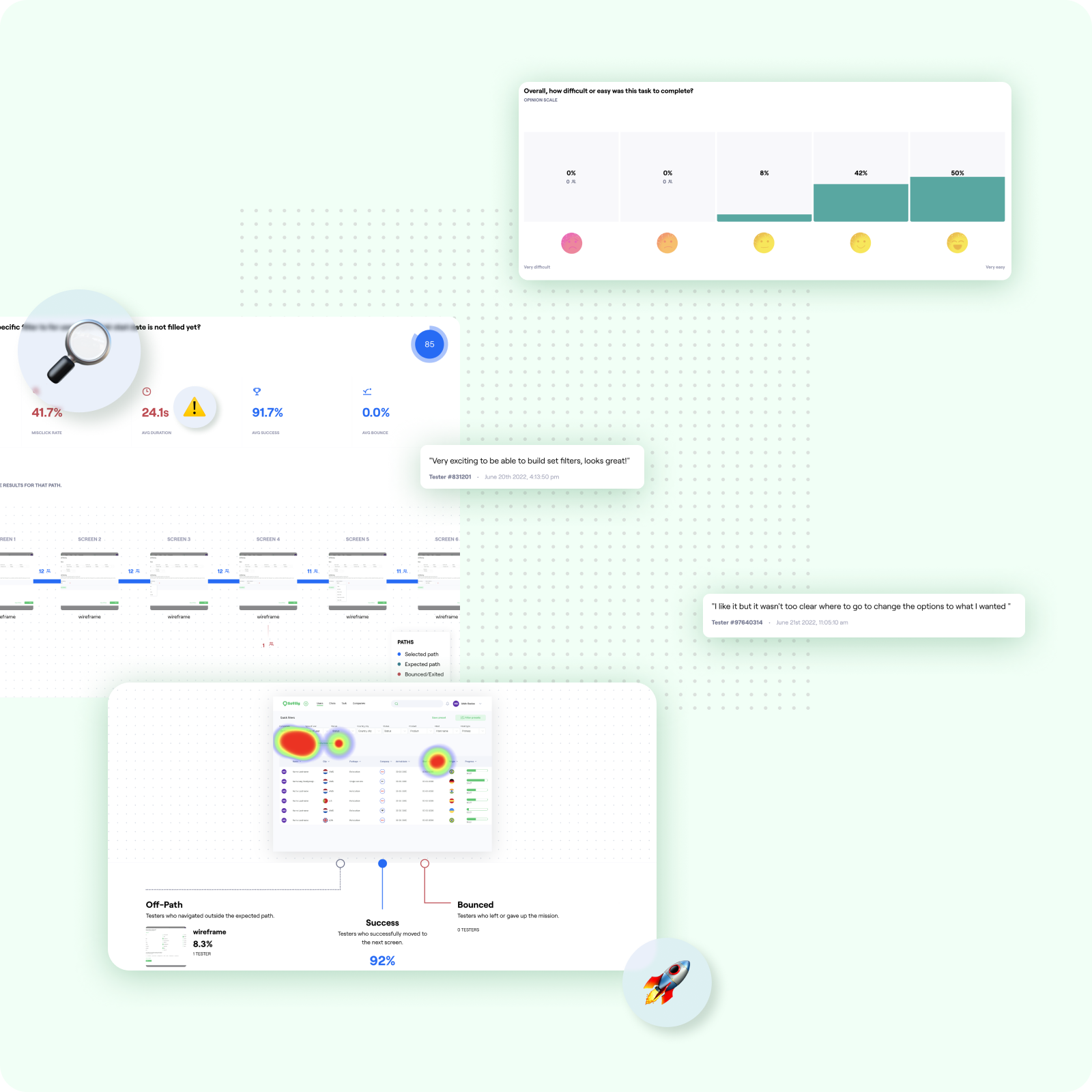
But before we set our sights on development, I embarked on a voyage of my own: a quick usability test to ensure our feature was ready to set sail. And let me tell you, we uncovered some hidden treasures along the way!
Main learnings:
- This type of user was used to Excel/ Spreadsheets, so they expected similar behaviors
- Dragging, was an important interaction for them to organize the columns of the table as they wanted.
Findability of items
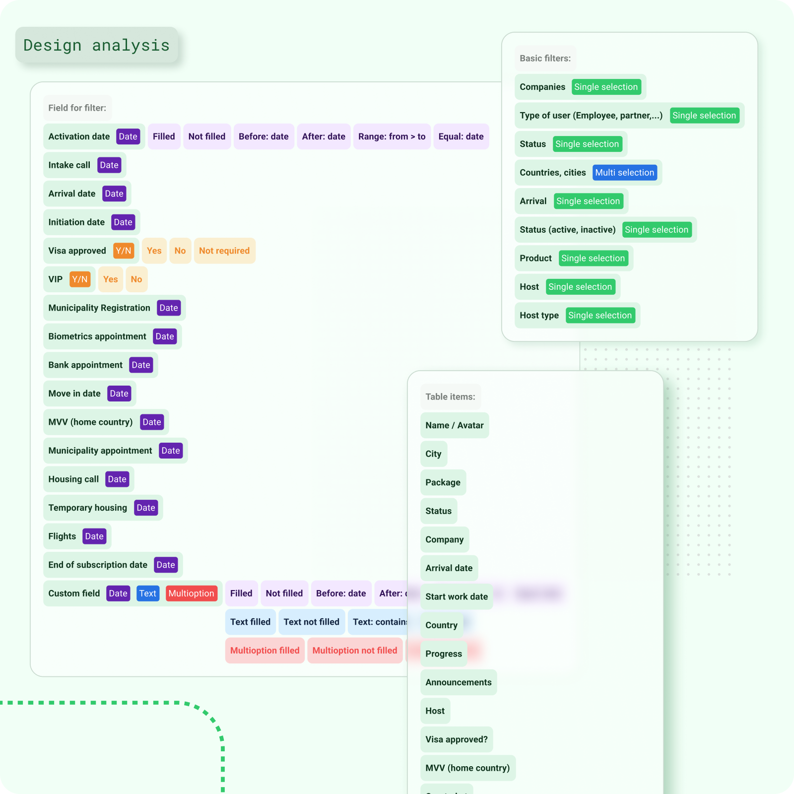
In the previous version, users often struggled to find the information they needed, which led to frustration and inefficiency.
To address this, our design approach focused on enhancing visibility and making each item stand out, ensuring that users can easily locate and access the information they're looking for. Additionally, we recognized the importance of empowering users with the ability to precisely filter information, enabling them to tailor their experience to their specific needs and preferences.
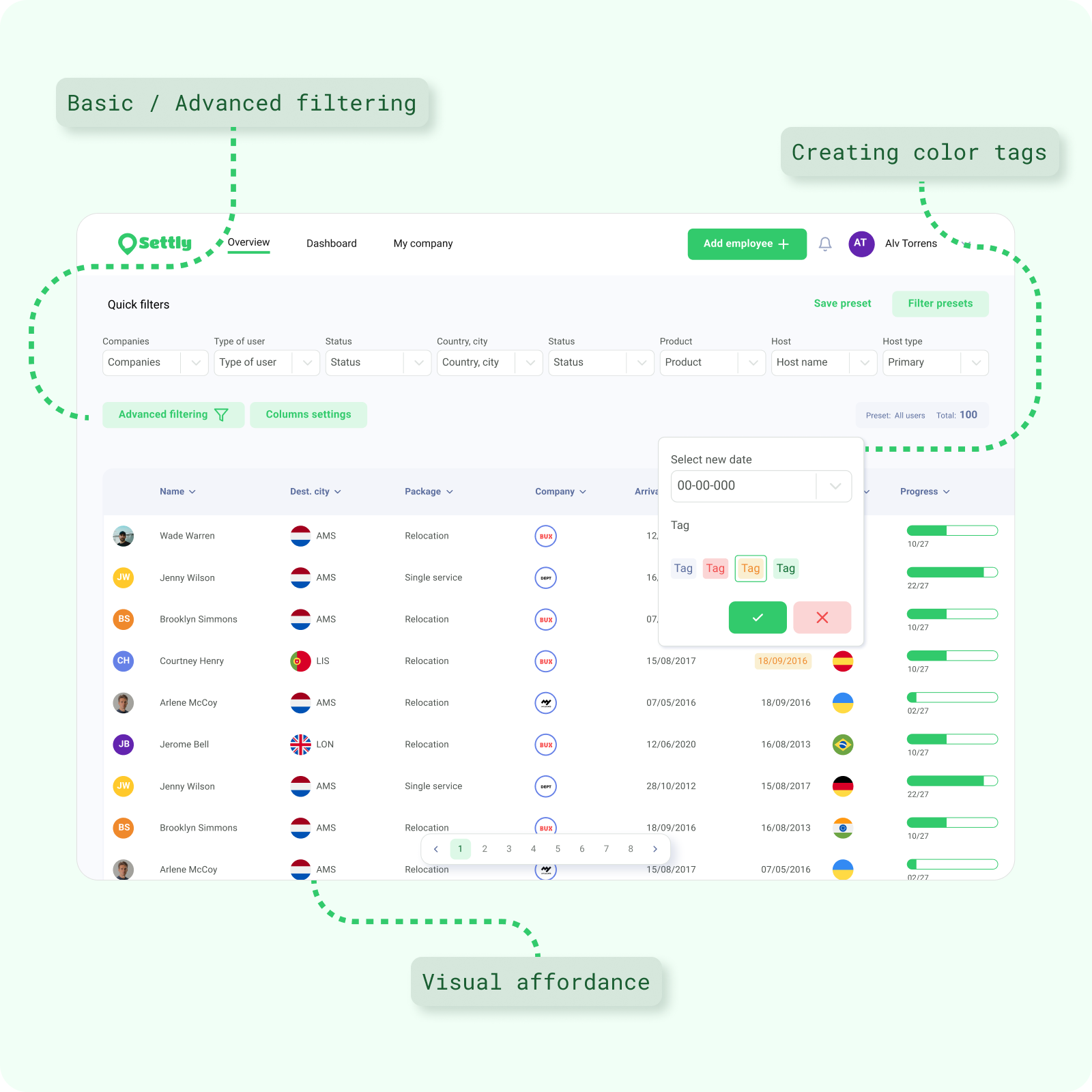
Too much cognitive load
Let's talk about tables—those notorious clutter-magnets of the UI world! You know the feeling: rows upon rows of data, all jumbled together like a messy closet.
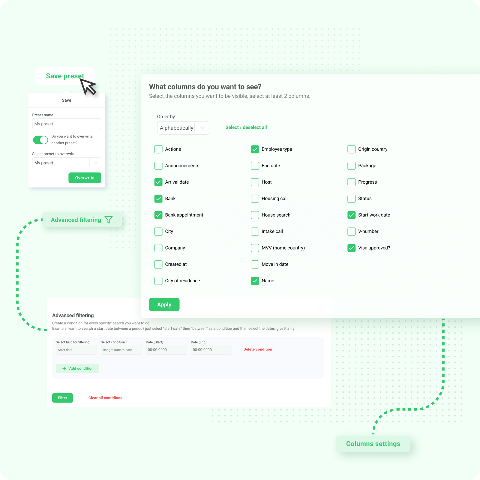
Well, we decided it was time for a makeover! We rolled up our sleeves, grabbed our virtual brooms, and got to work cleaning up that clutter. With our magic touch, we transformed those chaotic tables into sleek, organized masterpieces. But wait, there's more! We also gave users the power to take control of their data. With our nifty filtering feature, they can toggle information on and off like a light switch, customizing their view to fit their needs. Because when it comes to tables, who says you can't have both beauty and brains?
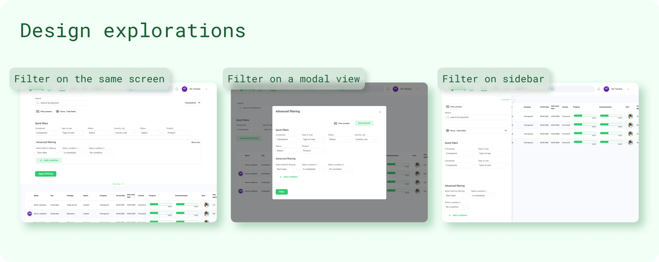
Extracting information
Picture this: You're on a mission to unearth the truth buried within your data. But wait—here comes the tricky part! Your managers need to extract, reorganize, and present this information to top brass or clients. Cue the stress! But fear not, because we've got your back. After filtering through the sea of data and pinpointing the gems you need, we've built a secret weapon for our managers—a quick and easy way to extract and organize that precious information with just a few clicks. It's like having your own data superhero swoop in to save the day! Because when it comes to reporting, we believe in making it as painless—and dare we say, as fun—as possible!
(And just like that, the request for information to the devs was reduced)
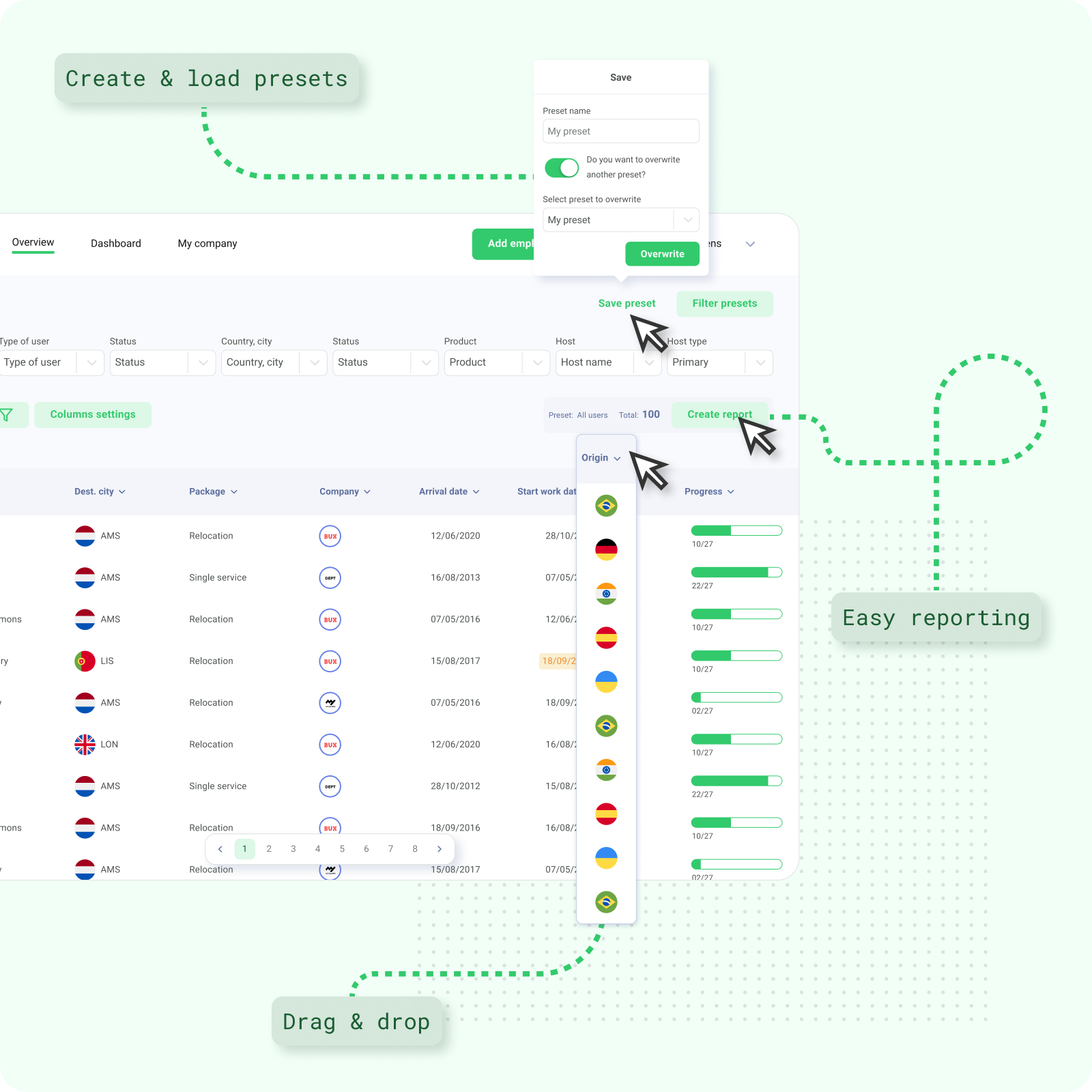
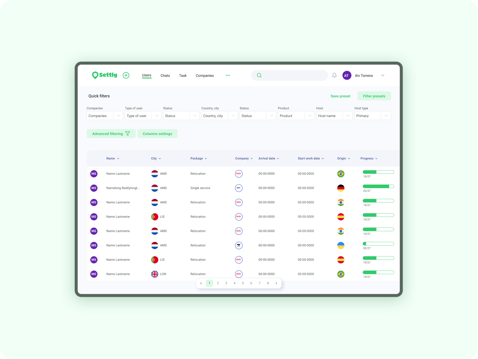
(Before on the left, After on the right)
Results
Drumroll, please! 🥁 After rolling out our shiny new feature, we didn't just kick back and relax.Oh no, we were on the edge of our seats, closely monitoring every click, swipe, and interaction like detectives hot on the trail of a mystery! 🕵️♂️
With our trusty sidekick, analytics, by our side, we delved into the nitty-gritty details, uncovering some seriously impressive stats!
Get this: our users were completing tasks 26%-30% faster, leaving their previous sluggish pace in the dust. And that's not all! Requests for info from the dev team plummeted by a jaw-dropping 80%! Talk about a game-changer! 🚀
But wait, there's more! Our team was over the moon to bid farewell to the headaches of inefficiency, embracing our sleek new system with open arms. It's safe to say, we've got some pretty happy campers around here!"
The results
26-30% ⌛️
Speed increase in case handling
%80 📈
Less requests to the dev team for data
4.7/5 ⭐️
Satisfaction from the internal team over previous version
Thanks for reading, you rock 🫶✨
Contact
© Alv 2023
UX / UI / Product designer / Human