Nobody panic. Your gate is somewhere that way.
Connecting flights are one of those experiences that can go brilliantly or catastrophically, often depending on information that should be trivially easy to provide. I spent some time figuring out why we weren't providing it, what it would actually take to fix, and what I got wrong along the way.
- Team
- Service designer, Business owner, Product team, Product designer (me)
- My role
- End-to-end Product Designer
- Key constraint
- No real-time maps, budget & API limits
- Year
- 2023 - Now (continuous improvement)
3.6/5
4.7/5
- of passengers found transferring at AMS genuinely challenging
- 33%
- shortest connection sold through a major hub airport
- 50 min
- missed connections: the biggest single driver of NPS drops in our data
- #1
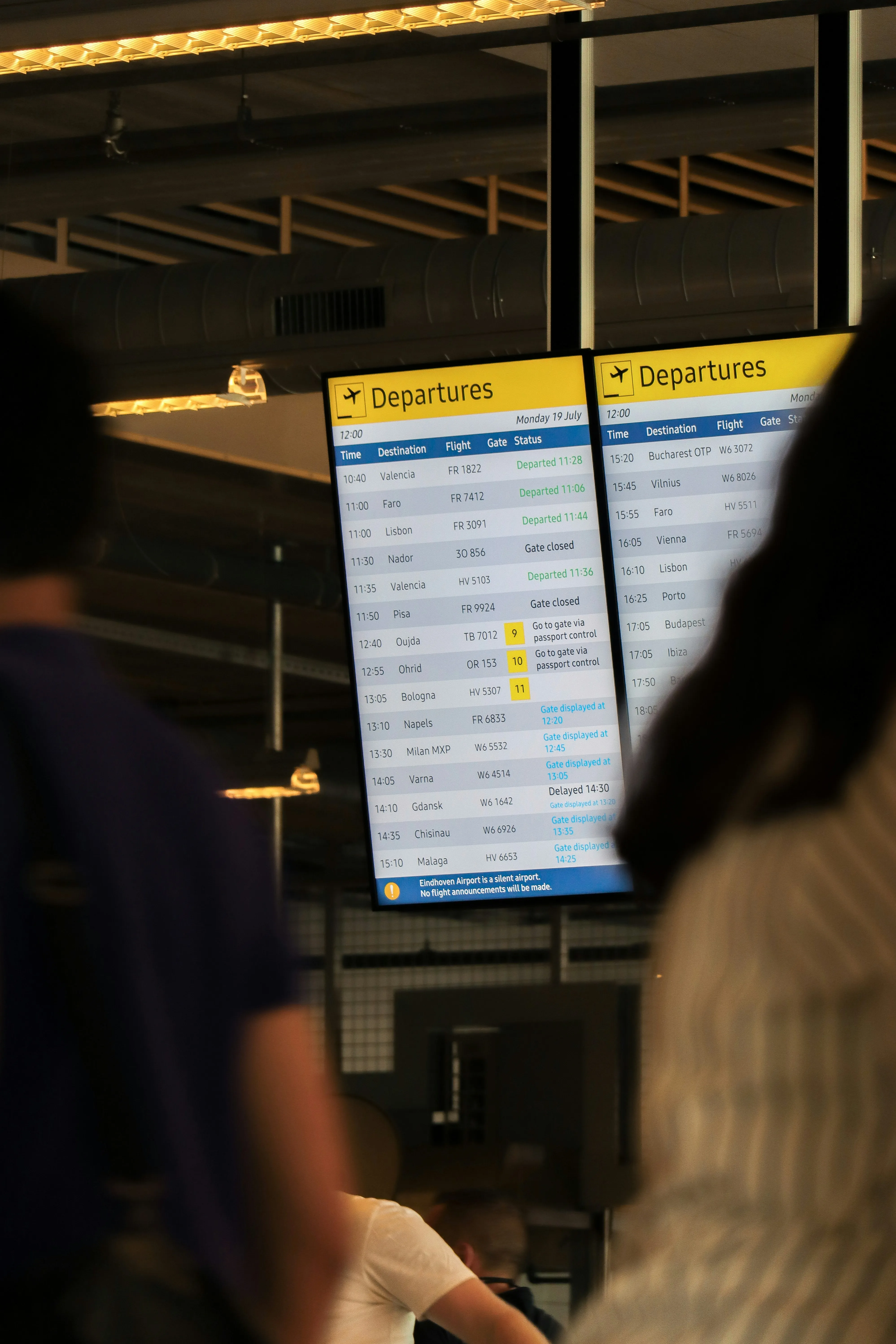
Passengers were navigating blind through some of Europe's busiest airports
Imagine landing with 70 minutes until your next flight and no idea where the gate is, how long security takes, or whether you are cutting it close.
That was the default experience for connecting passengers. When we looked into why, the same four problems kept coming up. People:
- did not know what steps to take,
- had no reassurance that they would make their flight,
- could not gauge how long the transfer actually took,
- and got almost no help from the airline’s app or website at the one moment they needed it.
Each round of research made the next design less wrong
I led the product design alongside a UX researcher and a service designer.
Our richest evidence came from a diary study, where 18 travellers documented their connections in real time as they moved through Amsterdam and Paris, capturing the experience as it actually happened rather than how they recalled it later.
Around that, we ran early concept tests, interviews focused specifically on missed connections, and several rounds of usability testing on interactive prototypes.
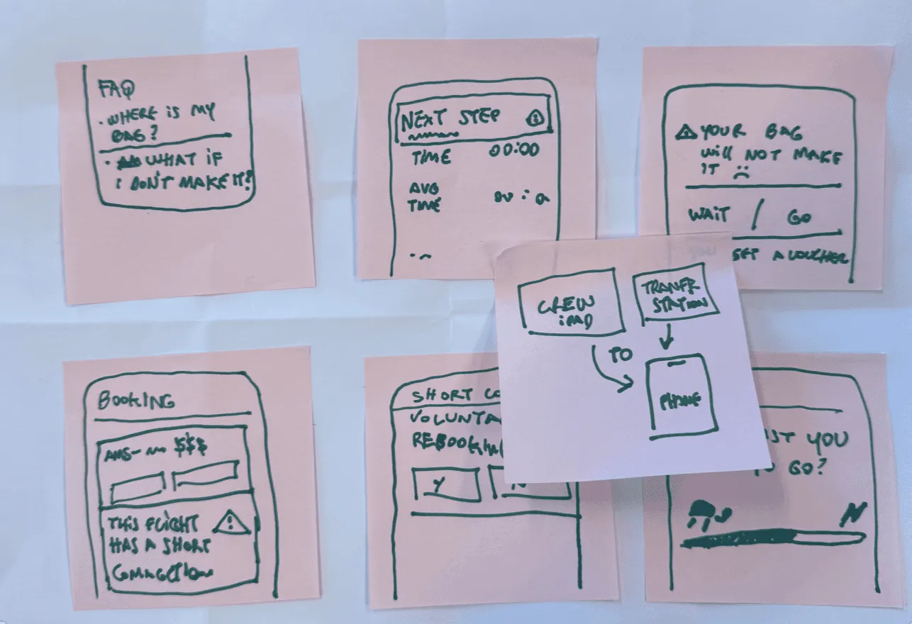
Our core findings came from frequent flyers, people who knew the journey well and could pinpoint exactly where it broke down. The final, sharper details emerged when we tested with infrequent flyers, who surfaced friction the regulars had simply learned to work around.
Together, the two groups gave us both the structural problems and the edge cases.
Timing beats volume.
Passengers did not want everything upfront, they wanted the right thing at the right moment. A heads-up before landing, confirmation on arrival, live guidance in the terminal. Staged delivery, not one comprehensive screen.
The thoughts that shaped the experience
Three moments instead of one screen
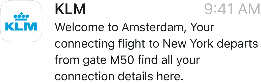
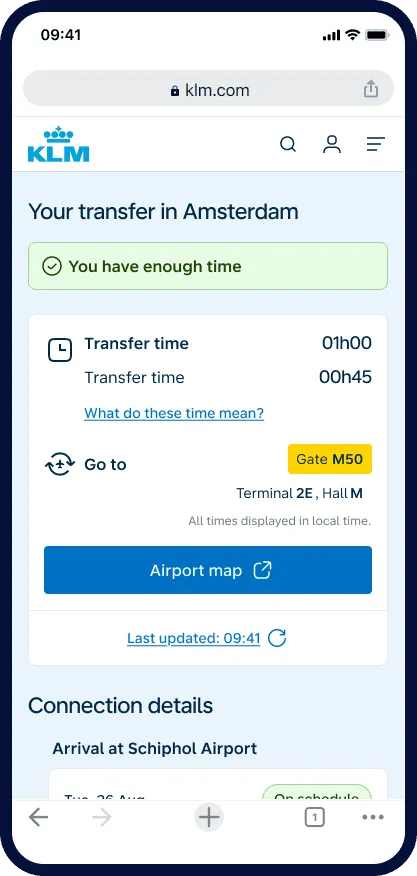
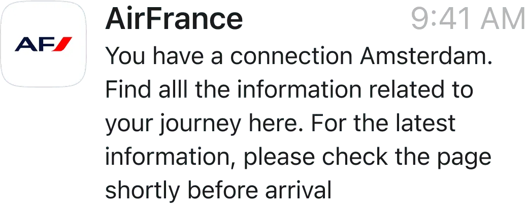
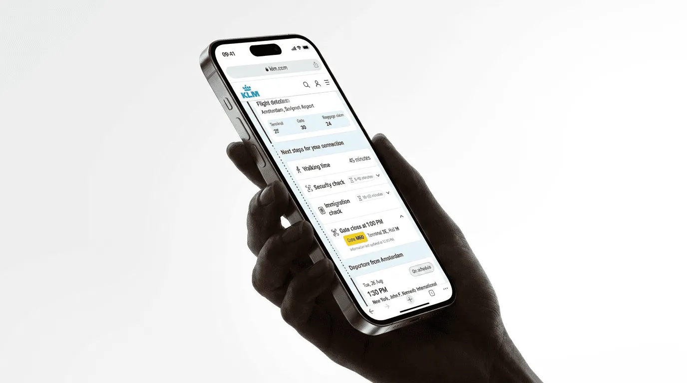
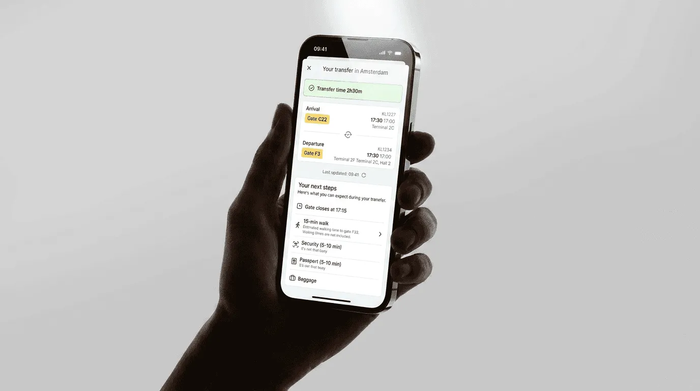
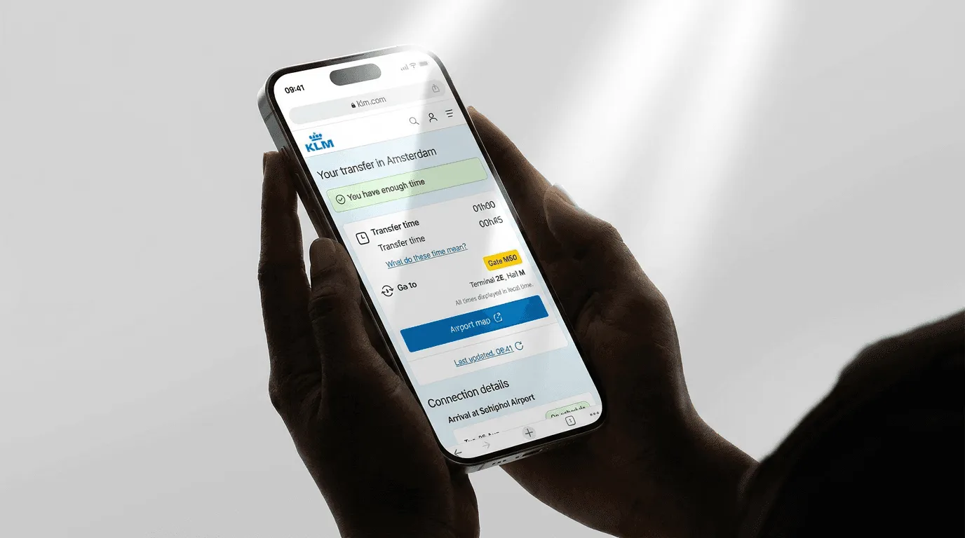
A pre-landing notification, an arrival confirmation, and a live in-terminal view, each answering one question at a different point in the journey, consistent across both app and web.
If you have the app, a notification pops up. If you don’t, we reach out through WhatsApp or SMS. We cover both cases, whether you are a frequent flyer or not.
Cut information until only the essential remained
We tested dense screens against minimal ones. The version we were most proud of, thorough and complete, performed worse under time pressure.
A passenger in a hurry scans for one number. The final design shows three things: where to go, how long it takes, and whether you will make it.
Pushed back on upselling inside the feature
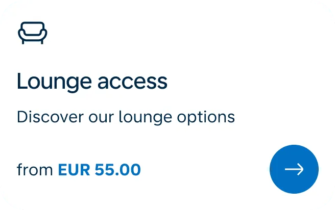
There was a push to include commercial content on the transfer screen, things like lounge upgrades and paid seat changes, the kind of add-on sales airlines rely on.
I argued against it, because a passenger hurrying through an airport is not in a buying mindset, and dropping sales prompts into a tool people open when they are anxious would erode the trust we were building.
We agreed on one exception: lounge access is offered only when the passenger has enough time to make their connection.
Designed for WhatsApp and SMS, not just the app and web
The passengers who needed this most rarely had the app, so we met them where they already were: a personalised WhatsApp message on landing showing their gate, walking time, and a link to the full transfer view.
No download required. That single channel decision is what drove the 96% satisfaction score.
What moved, and what's still open
For smooth, on-time connections, the experience is largely solved: a 3.6 to 4.7 rating shift, measured on the same survey instrument before and after launch, across 2,000+ passengers.
- Rating post-launch, up from 3.6
- 4.7/5
- Satisfaction among passengers who received the guided WhatsApp flow
- 96%
- Customers who confirmed the impact
- 2,000+
We didn’t control for seasonality, so I read it as a strong directional signal rather than a clean experiment.
The harder problem is disrupted connections. Passengers facing a missed or delayed flight still reach for airline staff before the app, though we’re seeing that preference slowly decline.
Earning full trust in the highest-stakes moments is the work that’s still ahead, and it’s the part I find most interesting.
What I would do differently
Boarding time is not gate closing time
We shipped boarding time as a key data point, and it seemed obvious. It was the wrong metric. For a tight connection, what matters is gate closing time, which can be 15 to 20 minutes earlier.
We learned this from passenger feedback after launch and fixed it in the next release. A good reminder that testing under simulated pressure and testing under real pressure are not the same thing.
Two emotional states need two design tracks
A passenger with a smooth, on-time connection and a passenger whose flight is delayed and gate is unknown are not experiencing the same situation.
For too long we tried to solve both with the same surface. But the disrupted flow is the high-stakes one, with the highest NPS impact. We have an MVP in place that covers the most common cases, and we are working towards making it more specific to each passenger.
Giving control to the users
View case →